We Help Home Service Companies Triple Their Job Bookings With ZERO Ad Spend
Discover the exact roadmap that our clients are using to increase job bookings and reach their goals.
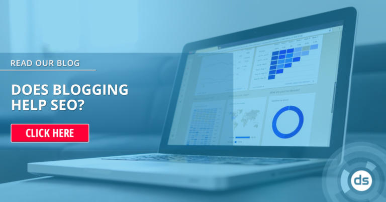
Get My Free SEO Marketing Plan
Trusted by over 1,500 business owners.


We Are Your Guide to Understanding How SEO Can Grow Your Business
We understand what it takes and the important road that you're on in order to grow your business and reach your goals.
We have shown 1,000+ business owners like you, the exact plan for doing just that.
Speak With An Expert TodayHelping Home Services Grow Faster With More Profit By Setting Up The Right Strategies & Systems
Here's How We Work
With more than a decade of experience, we know how unique every client and project can be. That doesn’t mean that every business has to come up with a new strategy from scratch. We’ve built a process that has consistently proven to be the blueprint for a successful online marketing strategy! Combined with a little input from you, we’re ready to take your business to the next level. Let’s get started:
1: Let's Talk
You get a 100% free no-pressure evaluation of the current state of your business’ online marketing.
2: Strategy Creation
We’ll discuss your business goals, what needs to change, and what needs to be tracked for you to achieve them.
3: Get Results
We’ll provide you with a digital strategy roadmap that details how to bring in new customers and grow your business.
Simply put, we implement real data-driven solutions that increase your sales and help you grow your business! We are 100% customer focused and work with you to win new customers online!
Schedule My Free Strategy SessionFrustrated That You’re Not Getting Real Results?
Let Digital Shift® build a predictable revenue-generating digital marketing strategy for you! We’ve simplified home service marketing and the complexities of managing your daily social media updates, Google posts, Facebook, Twitter, local search engine optimization, blog writing, and content marketing! Stay ahead of your competition by getting started today with a complimentary evaluation.
Speak With An Expert todayThe Digital Shift® Advantage
We earn your business and trust month-to-month
No pressure. We offer monthly services and keep you with us by delivering results.
You’ll have one point of contact that knows your business and you have a real relationship with.
You’ll know all the costs up-front with our easy to understand pricing model.
Get real results from real SEO experts while experiencing friendly service.
You'll never have to worry about any additional and unexpected fees when working with us.
See all your data anytime in real-time. You get full access to everything.
Just Ask Our Clients
The SEO agency of choice for home services ⏤ it's what we do

Above all, my business was able to be found for my services on Google Maps! I highly recommend Digital Shift for website optimization and online advertising.

Digital Shift is a very transparent agency who delivers quality work in a timely manner. I highly recommend them for local marketing.

Their highly in-depth knowledge & experience working in SEO has given my organization a strategic competitive advantage over our competitors.

I would recommend anyone looking to grow their online presence to reach out to Digital Shift. Their personal touch builds a relationship that truly lasts.

Working with Digital Shift has been nothing short of exceptional. They are truly incredible. We look forward to many more joint successes moving forward.

The team is very knowledgeable, friendly and professional in dealing with someone who is new to the back end of systems like these.

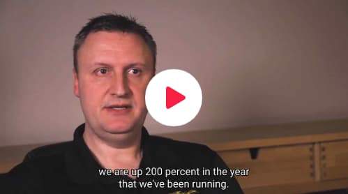
Our business increased by 200% within one year. I highly recommend home service businesses work with Digital Shift because they know what they are doing.

The Digital Shift team is dependable and conscientious and I would not hesitate to recommend them to any business looking to build their brand.

The team is very knowledgeable, friendly and professional in dealing with someone who is new to the back end of systems like these.
Our Vision
To be the go-to search engine optimization expert for home service companies.
Since 2007, we’ve helped 1,000s of businesses increase their leads using our tried and tested local online marketing tactics. We’re constantly learning, adapting, and delivering measurable results for our clients.
Let us help you stay ahead of the curve in all things digital marketing.
LEARN MORE ABOUT DIGITAL SHIFT®Let us help you stay ahead of the curve in all things digital marketing.


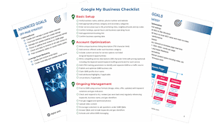
Ready to Give Your Company a Serious Boost?
Instantly download our in-house checklist to discover how we setup, optimize, and maintain top-performing Google Business Profiles every day!
Yes, I Want My Free Google Checklist Now